Subjectifying the Objective — or Objectifying the Subjective?
This project delved into the discourse analysis of data visualization and had the objective of exploring how and why data is discussed, defined, and understood, and its relation to structures of power or influence in society.
What is data and what isn’t? How subjective can a data set be? Can emotions, conversations, stories, or dreams be considered as such? Data is a word that is widely used and assumed to be clearly delineated, but is rarely defined by specific characteristics. Its simplest definition reads as “factual information used as a basis for reasoning, discussion, or calculation”. In fact, it seems that this word inherently connotes a sense of accuracy, certainty, and objectivity. And I wondered, how can data even convey lived experience, or interpretation, which are visceral, ephemeral, and subjective?

The Eyeo Festival (2011–2016), a yearly data visualization conference, served as the basis for this project. I watched and parsed all presentations, and analysed the content and context of the ones that addressed in some way my questions.
There are two ways through which data visualization approaches subjectivity: in the data itself and in the way it is communicated.

Using a simple coding technique to qualitatively analyze the content, the presentations were organized into two spectrums. The first ranges from subjective data (storytelling, conversations, interviews, interpretations, opinions), to pseudo-objective data (emotion, satisfaction, or symptom scales), and to objective data (any quantifiable information). The second ranges from subjective communication (abstract, arbitrary, and personal communication/design choices), to poetic communication (systematic, yet symbolic or metaphorical representations of data to communicate a message), and to objective communication (fully transparent representations of data), totalling six main categories.
A strong paradox emerged from this process. Most speakers employ approaches that intend, to varying levels, to either subjectify objective data, or objectify subjective data.

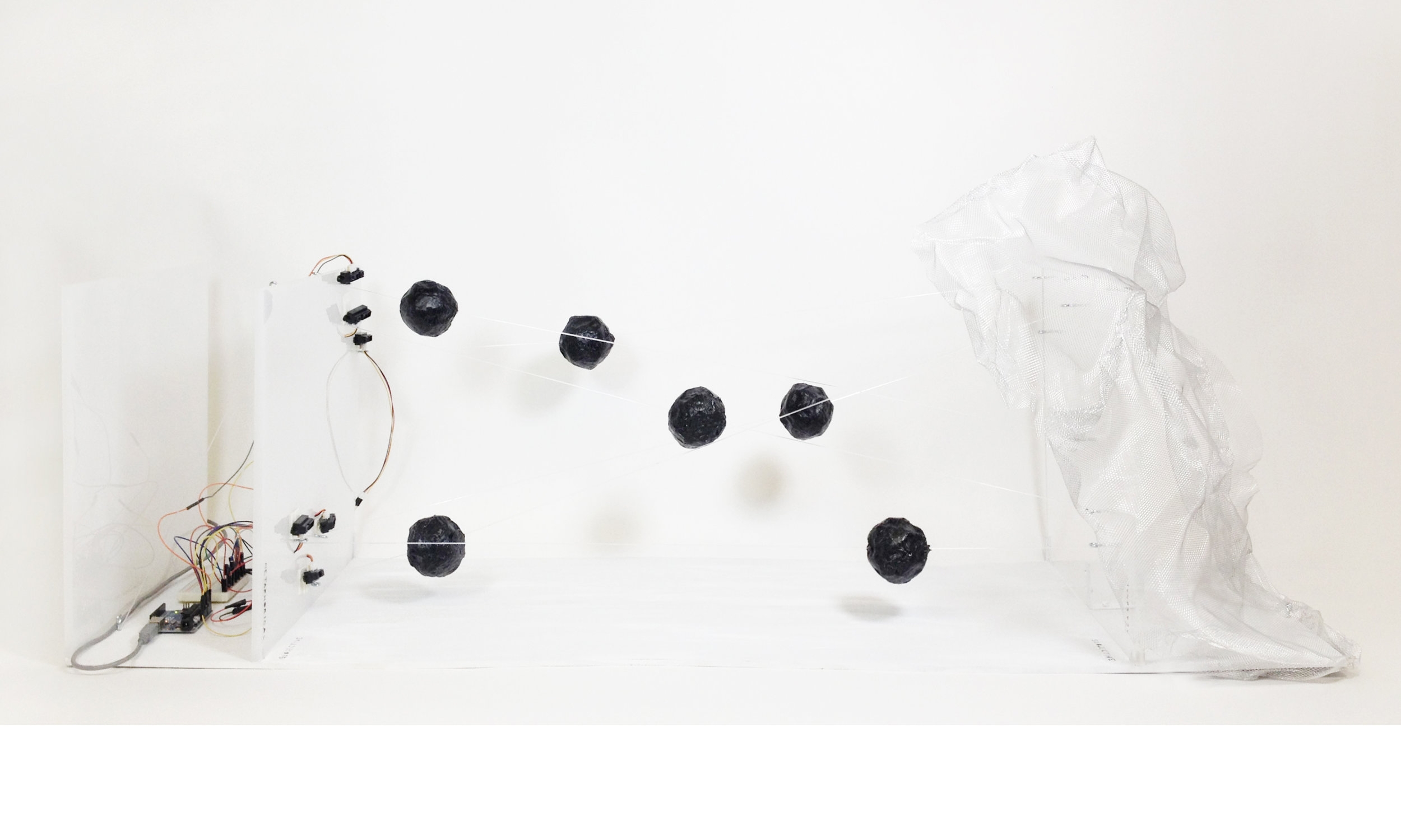
Aiming to create a data visualization that embodies this strong dichotomy and allows people to feel, experience, and interact with the data, I opted for a 3D format and decided to create a data sculpture.
Each wire represents one of the categories and functions as a tightrope between two upright planes, the data and the way it is communicated. Viewers move the balls along the wires, which at different points trigger audio clips extracted from speakers' presentations at the Eyeo Festival. Explaining the 'why' behind their approach, the audio excerpts articulate in a few words the process and argument of the speaker.


The interaction of the viewer with the data sculpture is organic, undetermined, and subjective, while the way it is captured and recorded — through an IR sensor array — to trigger the sound is precise, measurable, and objective.
Designed to create a different experience depending on the action of the viewer, the sculpture enables a synchronicity between understanding the object and understanding the content itself.
Individual project done in the context of Prof G. Hwang's Discourse Analysis in Data Visualization course, Pratt Institute, Winter 2017. Research & ideation, data gathering & parsing (in collaboration with other students), Arduino & Processing code, and construction of the sculpture.